
substance determining style
Marketing materials as a concept are simply the condensed embodiment of what they represent, a snapshot of a world, idea or message told to an audience through a multi-dimensional assignment of explicit and implicit communication methods. The more clear and aligned the marketing material is the more effective it becomes. The challenge comes from the balancing act of the aforementioned explicit and implicit means of communication; too much of one can drown other aspects of the message, the “focus” of the piece can be lost.
a call to action
A message is only relevant to the audience if they feel compelled by it’s contents; an effective message is only heard by those intent on carrying out it’s call to action. Therefore, we can imagine the underlying context and promise of the marketing materials’ message as fuel, and an emotional trigger as a spark. I found that this Mass Effect Poster as an example to elucidate how It communicates it’s premise effectively whilst then instigating the viewer with an emotional call to action.
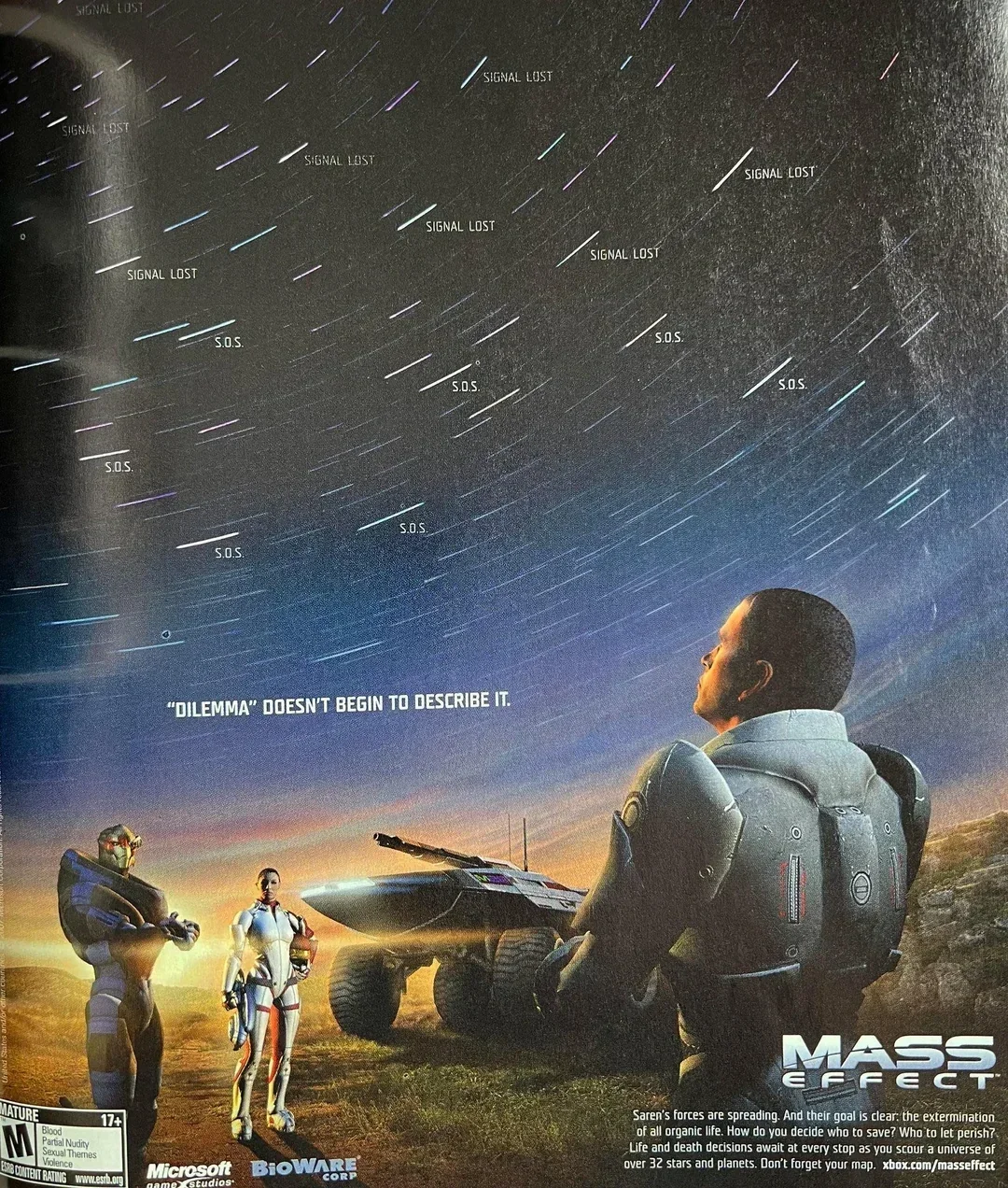
The SOS signals in the sky tell us that it’s an already colonized space, but it’s not a perfect future and there is dangers in the void.
SOS as a plea is a really extreme indication that the dangers are overwhelming
Shepard gazing into the sky at those signals shows he is aware and listening to those signals which implies he has the ability or intention to reach them.
The two supporting characters aren’t looking at the stars, one is looking to Shepard (Left) and another is looking directly at you the viewer(right), which draws an implicit connection between viewer and shepard.
The crew are not looking at the bigger picture like you and shepard; they are looking to you for guidance.
The text “Dilemma doesn’t begin to cover it” written presumably from the perspective of an in world character tells that this isn’t going to be a straight forward romp through space; you will be given choices and decisions that are unable to be made by the character (shepard) alone, hence why you are needed.
As a whole, that message is about a universe that needs help and that you can fill that role.
Other aspects of this poster demonstrating it’s premise are:
The presence of aliens amongst humans shows that it is a “post contact” universe
Said aliens being in close proximity to humans on poster shows it is not a game expressly about humans vs aliens.
The presence of the vehicle implies that long distance travel is possible and with the addition of looking to space it helps draw the conclusion that exploration is a core element of the game.
The name is secondary to the expression of the concept.
Empathizing with the machine
Our game “SOL CONSTRUCT” is defined heavily by it’s vehicular nature and is further distinguished by it’s intentional absence of humanity or living entities within it’s machine world. As a direct result of this, it initially would appear that our ability to lean on using human characteristics to drive an audiences means of identifying or empathizing with our world and it’s (non-life characters) is hindered.
However, through research I found that it is a very severe misconception that a human face or direct representation of a human is necessary for driving self identification from an audience. Instead, I believe that identification with a concept or struggle can be entirely abstract but contain relatable themes or emotions.
An example of this was found within World of tanks Posters.
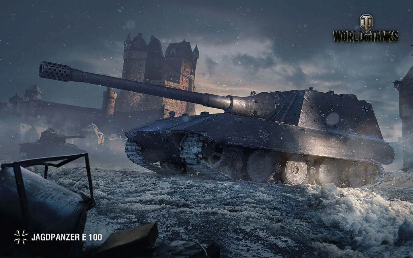
Across all the Posters for World of Tanks, the tank itself is the main focus, and is personified through intentional positioning, viewpoints and surrounding context. For example, the above JADGPANZER E100 poster shows a settled and stalwart metal behemoth looking distantly ahead. In the background is a snow laden castle alongside a destroyed tank.
The castle is a metaphor for the vehicle itself; the castle stands motionless against the impending threat of invasion or against harsh climate. It’s thick walls and distant view of oncoming dangers are mirrored by the tank but with walls of steel instead of brick but still sharing an unshaken resolve to hold it’s ground, sitting in place rather than charge.
Whilst a human is never shown, humanity and it’s intentions are implied through the mere presence of the two.
Lastly, the very concept of a tank and how it factors into the evolution of warfare is touched upon as tanks are in essence a mobile fortress
Meaning in visuals
Halo 3’s poster was a solid find for us as it demonstrated an ability to implicitly communicate the tone of a story at a glance but manage to include enough detail so that an extended view would reveal additional context to it’s material.
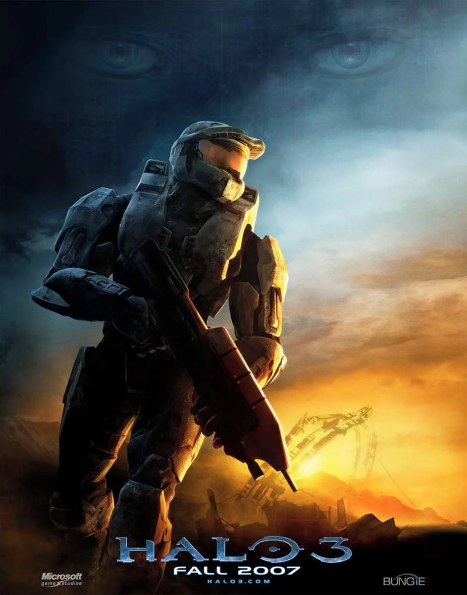
The overall tone is one of finality, hints of melancholic uncertainty as to the result of that are what drive the intrigue of this poster.
The most striking detail is the color blend of that burning sun in the distance which coats important details that draw the eye.
Environment
That the particular color gradient is associative of either sunrise or sunset. It is therefore either the end of something, or a new beginning. This directly correlates to the context of the game, being the final entry in the trilogy and the ultimate conclusion of all previous events.
Master CHIEF
The way the sun light coats The Master Chief on his side shows against a harsh contrast of dark blue shows he is coming from darkness into light, helping draw conclusion that he is moving towards his goal.
His lowered weapon (but still held firm) represents the lowering of a guard and that while not in immediate danger, he expects there to be.
His visor is showing a strong sheen from that burning horizon as he is fixated on what is to come
His rising head shows an ability to rise to the challenge
The weathering on his armor shows the history behind his story and that his challenges have been many.
Result
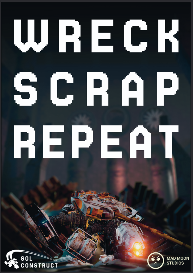
The broad text explicitly tells the motive of the game loop
The blurred background reinforces that the focus is on the ship in the poster and it is a story about them within the surrounding universe.
The ship itself is almost wallowing in a pile on the ground, showing a struggle but unwillinginess to submit
Something has punished this powerful looking machine and whatever that something is has imprinted a nervousness within said machines ability to continue.
The ship being amongst junk implies that it is connected to junk somehow.
The turret facing downwards shows an expectation to fight but a current moment of doubt or discharge.
The Nose of the ship (with a light) looking to the viewer with a lowered gaze is implicative of struggle and a plea for assistance - granting the viewer the notion that they have the power to control and or uplift this craft somehow.
The composition of the ship being towered over by the text and the enviornment in the background draws the linkage that the above text is the ethos of the world itself and the ship is prey to it.
The Poster was ultimately based around the call to action of the ship being at the mercy of such a greedy and consuming world. The viewer is looked to as the instigating force behind a rising phoenix tale to uplift and take control of the ship and explore/survive the world.
Trailer
If a poster is a snapshot of a universe then a trailer is given the extended potential to demonstrate the more in depth corners of the game and concept.
I really admired the Borderlands 2 “Doomsday” Trailer in how it showed you every element of the game as an attraction force whilst blending it with the intriguing spins of the particular mechanics to be found.
The use of descriptive text that speaks in the tone of Borderlands humor does a great job at bringing across the entire picture of what Borderlands 2 as a whole. Combined with the music choice and editing style there is a sense of real confidence that is gleamed from the trailer. The trailer’s audio is mostly just the music; game play audio is muted besides expertly emphasized moments of sound added in post such as the sword slash or roar from a creature.
Our first draft of a trailer took heavy inspiration from outlining the point of the game through text and in particular trying to cultivate the tone through visuals and music.
The most challenging aspect was matching game-play clips to the background music. Video clips out of sync with the tempo has the opposite effect of hooking someone’s attention and instead feels flat and incongruent, worse, distracting.
The first attempt at the trailer I felt managed to produce the desired effect of communicating the game premise and overview of the setting but admittedly had short comings with regards to the depth of mechanics shown in the visual aspect.
The main message of the trailer is to WRECK (Combat) SCRAP (Looting) REPEAT (Replay-ability) and the clips are spliced between those bold messages to reinforce those 3 pillars of our game-play loop. We did this to be absolutely clear about the promise of the game and to establish a visual link between our phrasing and the game’s style - In essence, become the first impression of SOL CONSTRUCT as a game in whole.
In the second version of the trailer, updated versions of game-play interactions were applied to the sections of the video that needed more clarity but they did not change anything about the length or placement.
The swapping of clips yet consistent tone is a positive indicator that the direction of the trailer and additionally SOL CONSTRUCT has developed a set tone and voice.
For the future of the game it is a really exciting breakthrough for us and has grown our confidence in speaking as the game to an audience.
